Color space is a topic that students of digital visual media need to understand. But it can often be a difficult topic because there are a lot of pieces that go into it. The goal of this section is to help you understand and interpret what color space is without getting too bogged down in the details.
The Perception of Color.
In the previous section, we talked about how different wavelengths of light generate different colors. However, we did not say that every color that we see is the result of a particular wavelength of light. You will not find pink or brown in the rainbow. So where does it come from?
A device known as a spectrophotometer can be used to measure the amounts of all of the incoming wavelengths of light. These can generate graphs (called the "spectral power distribution") that will show peaks around the wavelengths of light that are the most common when viewing an object. While we could say that these graphs can "define" colors for us, and this would be a very scientific and concrete way to understand colors, this isn’t what actually happens in our heads. Our eyes are simply not as sophisticated, and we aren’t able to isolate the exact wavelengths of lights in that way. All we have are our three colors of cones. This means that our understanding of color is going to be much simpler.
The solution our brains have developed is that it invents new colors for us to see when we’re seeing mixtures of wavelengths at the same time in the same spot. So if the red and blue cones are being activated in the same spot, our brains create a color that we call magenta to try to tell us that this is a mixture of colors.
An important fact about our color perception is that it depends on the level of activation of the cones, and not the actual wavelengths of light that are hitting them. So we might perceive two colors to be the same even if the spectral power distributions are different.
The In-Between Layer.
Imagine that you’re watching a sunset. What is the physical process that’s happening to allow you to experience it? The sun is generating photons, which are bouncing around all through the atmosphere and off of the ground, the clouds, the trees, and anything else that you see. Those photons then reach your eyes, which causes your brain to generate a picture that you interpret as watching the sunset.
Now imagine that you want to take a picture of this sunset so that you can see it again at some point in the future. This will introduce (at least) two more steps into the process. The first thing you need to do is to try to capture the photons (you do this with your camera), and then you need to find a way to reproduce those photons using a medium of some sort (your cell phone, your computer monitor, or your printer). We are going to focus on digital images because it presents a distinct set of challenges from analog images.
In this in-between layer, we create opportunities for errors to occur. Some of the errors are generated from things like an out-of-focus camera or corrupted data. But even if all of that were perfect, we still have a significant challenge. How do we capture reality and then reproduce it? The concept of color space is specifically focused on trying to figure out how to get colors as "correct" as possible.
The challenge is that cameras, like our eyes, are limited in the information they can capture. They aren’t capturing all of the information like a photospectrometer would. What is typically happening is that there is a sensor called a photosite which converts photons into voltages, which are converted to digital information. And then that digital information will need to be re-translated back into colors generated by a monitor, which can only generate three distinct colors with different levels of intensity. So the broad spectrum of photons that you started with gets boiled down to essentially three specific wavelengths, which somehow needs to capture our experience of color.
Color Space.
Color space is our attempt to take what we can understand about human perception and do what we can to recreate as closely as possible an experience of reality within the limitations of the equipment that we have. The first thing we need to do is to chart our experience of colors. It starts with a graph that looks something like this:
Figure13.2.0.1.Image taken from https://www.studiobinder.com/blog/what-is-color-space-definition
There are actually lots of graphs that can be generated, and they are all different ways of trying to conceptualize the same thing. The main features of each of these graphs are the following:
The boundary of the shape represents the visible light spectrum. In this specific example, the wavelengths are specifically indicated, but not all graphs will have this feature.
The colors that you see represent colors that are perceived. These colors are based on both theoretical and empirical data.
If we mix two wavelengths of light, we perceive a color that is somewhere on the line connecting them. Exactly where along the line it is depends on the relative intensity of the two wavelengths. In general, the perceived color is the weighted average of the wavelengths.
Gamuts.
The purpose of color spaces is that provides us a framework for understanding how colors can be translated through the in-between layer.
On the recording end, we need to be able to understand and interpret the data we are collecting. If we had two color sensors where each one only detected a single wavelength of light, then the only colors that we would be able to record would be on the line connecting the two points on the boundary corresponding to those wavelengths. In other words, the color space that the camera could access is limited, and it will be unable to reproduce colors outside of that range. This example is mostly theoretical because modern technology doesn’t have this type of limitation, but it is an important conceptual point to help understand the next part.
On the reproducing end, things are quite a bit more complicated. To keep our discussion as simple as possible, we will focus on RGB color schemes, which are used for electronic monitor displays (desktops, phones, tablets). These displays can really only create three distinct colors of light, namely red, green, and blue. But exactly which colors it generates depends on the specifics of how the electronics are set up. You might be familiar with trying to calibrate a monitor by turning the brightness up or down, or adjusting the contrast. Regardless of the specifics, there is a particular color of red, green, and blue that are generated, and those colors are located somewhere on thee color space. Once those three colors are identified, the only colors that can be displayed live inside of the triangle formed by those three points.
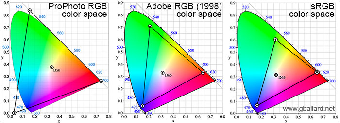
The goal is to have the colors collected by the recording end to be perfectly matched up with the colors generaeted on the reproducing end. And the only way this can happen is if there is agreement about what the colors are. And this is where the various standards came from. The following diagram shows three common color spaces:
Figure13.2.0.2.Image taken from https://stephaniebryanphoto.com/myblog/understanding-color-space
The triangles are known as gamuts, and they represent the range of colors that can be represented under the different color concepts, and this is based on the specific red, blue, and green that is used by that gamut. It also shows how using the wrong standard on your display relative to the camera can lead to poor results. For example, if your camera is set to Adobe RGB but your computer is set to interpret the data as sRGB, you will find that your greens are a little more yellow. This is because the camera’s concept of green is more green than green of sRGB. And this is why it is important to make sure that you are using the same settings on both sides of the process.